
Introduction
Hikari is a company in the making. It is inspired by Japanese culture, hence my inspiration for this logo. More below.
My Approach
My task was to create a logo that connects two countries, Japan and Herzegovina. It was necessary to use symbolism and culture, but to connect the two given countries. After researching the industry and reviewing the client's wishes, I started creating and came up with the logo you see at the top of the page.
Brand Identity Keywords
Hikari - meaning light/shine
Typography, color palette and iconography
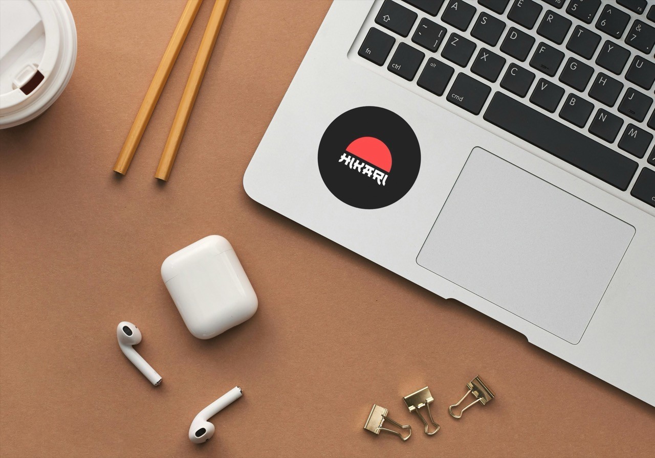
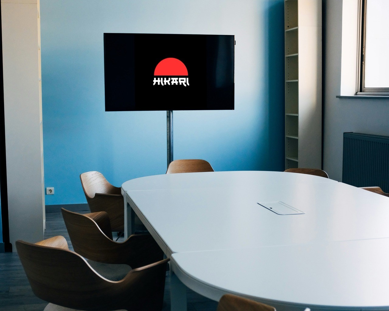
I decided to use 'ST Tokyo hieroglyphs' font. Color palette is very simple - clear white(#ffffff) for typography, black (#000000) background and red-ish (#ff3131) semicircle representing Sun.
Final Design
Japan is well known as 'Land of the Rising Sun', so is Herzegovina known for very sunny weather throughout the year. Taking this into account, it was logical to use the Sun as the main motif of the design. Because of the inscription 'Hikari', the circle of the Sun has become a semicircle, but it is still extremely recognizable, because it irresistibly resembles the sun from the Japanese flag. The font completed the Japanese aesthetics, making the inscription legible and still interesting to the eye, rounding off the design to an aesthetic and recognizable shape.