

Introduction
Sweatshirt design for community needs. More below.
My Approach
Since the client already had a logo (by Scribus Design too), a color palette and certain typography, we had a vision of the entire sweatshirt in advance. Minimal, yet impressive.
Typography, color palette and iconography
The red color used was from the spectrum #c63647, the typography was adapted to the needs of the print, and the iconography was specially made for this sweatshirt.
Final Design
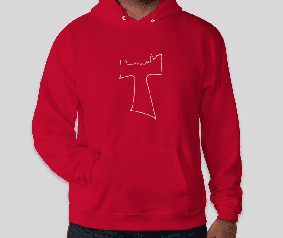
The front features a Tau cross, which instead of the upper surface has the outline of the place where the community operates. On the sleeve is a hashtag with the abbreviation of the community name. On the back, the community name is combined with the outline of the local church, which is one of the symbols of the community. All combined, it creates a recognizable and aesthetic sweatshirt. The sweatshirt is already used by over 150 community members.